
Product Personalizer - Live Mockup Settings
Product Personalizer - Live Mockup Settings
Plan: Live mockup (Product personalizer) is available on the Platinum plan and above. On the Free plan you can try it on one live product with a Premium option set. See Plans and feature availability.
What is Product Personalizer/Live Mockup?
Live Mockup allows shoppers to see their customizations applied to the product in real time before adding it to the cart. As customers select options (text, images, colors, buttons, swatches, etc.), the product preview updates instantly, showing exactly how the final product will look.
What Live Mockup Can Do
Live Mockup works seamlessly with your product options and variants to:
- Instantly reflect option changes on the product image
- Display text inputs, uploads, or selections directly on the product
- Update visuals without page reloads
- Support multiple option types: Text box, File upload, Image & Color Swatch (Note: Text box’s live mockup can be combined with Color picker, Color Swatch, Font picker to preview text color and styling in real time).
Customers can interact with options and immediately see the result — no guessing, no surprises.
👉 View demo: Personalize Phone Case, Custom Tote Bag, Custom Pet Necklace
When to Use Live Mockup
If customers need to see it to trust it, Live Mockup is the right solution 🤩.
Use cases
Typical examples
Why Live Mockup matters
Personalized products
Engraved names or messages.- Custom text on apparel, mugs, phone cases
Customers see exactly how their custom requests look on the product before buying.
Visual option differences
Color or material selection- Pattern or style changes
Instantly updates the product image, making comparisons easy and intuitive
Print-on-demand & custom designs
Uploading personal logos or images- Choosing print positions- Previewing artwork layout
Helps customers confirm design placement before checkout, reducing order errors
Paid add-ons & upgrades
Gift wrapping styles- Extra decorations or finishes- Paid engraving or personalization
Visualizing upgrades makes added costs easier to justify
Made-to-order or non-returnable items
Personalized or custom-built products
Visual confirmation is critical when products can’t be resold or returned
Result: Shoppers feel confident in their choices, while merchants benefit from higher conversions, fewer errors, and reduced support requests.
How To Set Up
A. Explaining the setting panels
- Live Mockup tab
For options that support Live Preview (Text box, File Upload, Swatch), you’ll see a Live mockup tab located at the top right.
- What it does: The Live mockup tab controls how the option appears in the live preview on your product page.
- How it works with Option Content tab: The Product personalizer uses values from Option Content, so we recommend setting those up first.

- Preview panel: Select background
When Live Mockup is enabled, start by selecting the Background first.

Select background

Preview After choosing a background, decide where the preview should appear:
All product images (default)
The preview appears on all product images. When customers switch between images, the preview remains visible on each image.
First product image only
The preview appears only on the first product image. If customers switch to another image, the live preview will no longer be shown.
Variant image only
The preview appears only on the selected variant’s image. When customers change variants, the background updates to the corresponding variant image, and the preview is shown on that image instead of the main product image.
Last product image only
The preview appears only on the last image in the product’s media list.
Specific product image
The preview appears only on a specific product image, based on its position in the product’s media list. Enter the image order number to select which image the preview should appear on.

In the Select background window you can set:
- Background type - Main product image (uses the images of your product) or Custom background (upload your own image in JPG, PNG or WEBP format).
- Preview mode - which product image shows the preview (see the table above). For Specific product image, enter the Image index.
- Select product for preview (Main product image) - the product whose image is used while you set up the preview.
- When to show background (Custom background) - The first product image from start, or Overlay when image/text option is selected or added (the custom background only appears after the customer fills the option).
Click Apply to save the background. Use Change image to change it later.
Note: The preview may look smaller during setup. Use Zoom In to check details. The final preview on your live store will display as expected.

How to set up the Product Personalizer (Live Mockup)
- Decide which options need Live Preview (whether it is Text box / Swatch / File upload)
- Set up the option settings first
- Tick Enable live mockup in the Live mockup tab (it shows customers what their customized product looks like in real time)
- Select background & preview options
- Configure the Live Preview → Save → Choose product/customer condition for the option set

Configurations explanations:
- Position (X-axis, Y-axis, Rotation): where the content sits on the product image. You can also drag and drop the preview anywhere on the product image.
- Style (Text box): Font source, Color source, Font size, Curved text angle, Opacity, Max width (tick Enable max width) and Text alignment (left, center or right). These are the default settings used in the preview and applied to the final product.
- Allow customers to change: choose what customers may adjust. For a Text box: Text position and Text size. For a File upload or Swatch: Image position and Image size. When customers can change the text size, choose how: Resize text directly on preview, Adjust with size input field or Allow both ways. Leave these unticked to lock the design.

Text box
- Preview text: The text shown in the preview (placeholder: "your text"). If a Default value is set in the option's Content tab, it is used automatically. If not, enter a sample value here (for example: “Add text”). Changes here affect the preview only and do not sync back to the Content tab.

- Color source > Link with Color swatch (applicable for color swatches only): Use when you want customers to select predefined colors for the text. Set up the Swatch option before linking it.

- Color source > Link with Color picker: Use when you want customers to select their preferred color for the text. Set up the Color picker option before linking it. Choose Custom to use one fixed color.
- Font source > Link with Font picker: Use when you want customers to select the font of the text with a Font picker. Choose Google fonts to use one fixed Google font.

File upload & Swatch
- Preview shape: Choose Square, Polygon, Ellipse, Star or Heart, or upload your own with Upload custom shape (Custom shape).
- Preview image width / height: the size of the preview image (click the lock to keep the aspect ratio) and Preview image sizing (Cover, Contain or Fill).

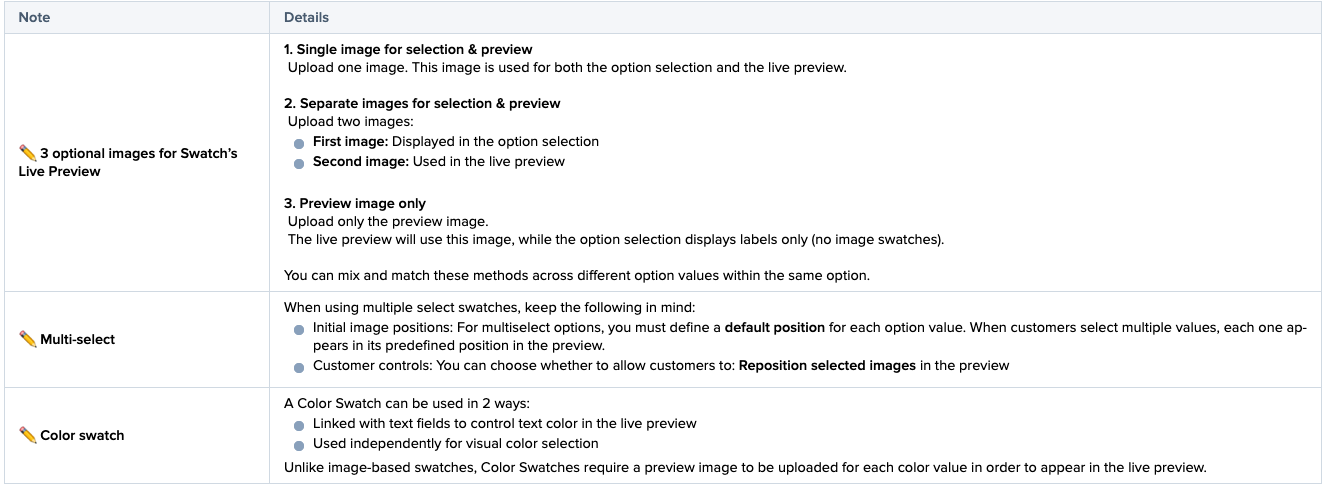
Swatch

Updated on: 24/09/2026
Thank you!